
BC Hydro Homes+
Homes+ enables homeowners to complete a professional-grade home energy assessment independently, helping them understand their home's performance and identify upgrade opportunities.

BC Hydro
IOS
April 2026 - now
Lead product designer
Research, UX, UI, Design System, User Testing
Challenge
Home energy assessments have traditionally been conducted by trained professionals. They understand building systems, know what to inspect, and can complete the process efficiently.
Homes+, however, was designed for homeowners with little or no technical knowledge.
The challenge wasn't simply creating an app—it was designing an experience that could confidently guide first-time users through a complex home assessment, helping them capture the right information, complete every required step, understand the results, and ultimately connect with BC Hydro's energy efficiency programs.
Research
1. Stakeholder Interviews
Understanding business goals
• Increase homeowner participation
• Improve assessment completion
• Validate a scalable digital assessment model
• Drive retrofit adoption
2. Product Audit
Reviewing Stride painpoints
• Built for trained energy advisors
• Heavy use of technical terminology
• Minimal guidance throughout the workflow
• Optimized for efficiency, not learnability
3. User Research
Understanding homeowners
• Little knowledge of home energy systems
• Unsure what information to collect
• Needed reassurance throughout the process
• Needed reassurance throughout the processPreferred simple, step-by-step guidance
4. Competitive Analysis
Learning from consumer products
• Guided onboarding
• Progressive disclosure
• Clear progress feedback
• Action-oriented results
Key Insight
Homeowners didn't need a simpler assessment—they needed a guided experience that made a complex assessment feel simple.
How might we...
Help first-time homeowners complete a professional-grade energy assessment without requiring technical knowledge?
Design Principles
Guide, don't instruct
Break complex tasks into simple, guided steps.
Make complexity approachable
Replace technical terminology with plain language and visual guidance so homeowners can complete the assessment without prior knowledge.
Build confidence through feedback
Provide progress indicators, confirmation states, and review steps so users always know what to do next.
Turn insights into action
Present homeowner-friendly reports with personalized recommendations and relevant BC Hydro rebates, helping users confidently take the next step.
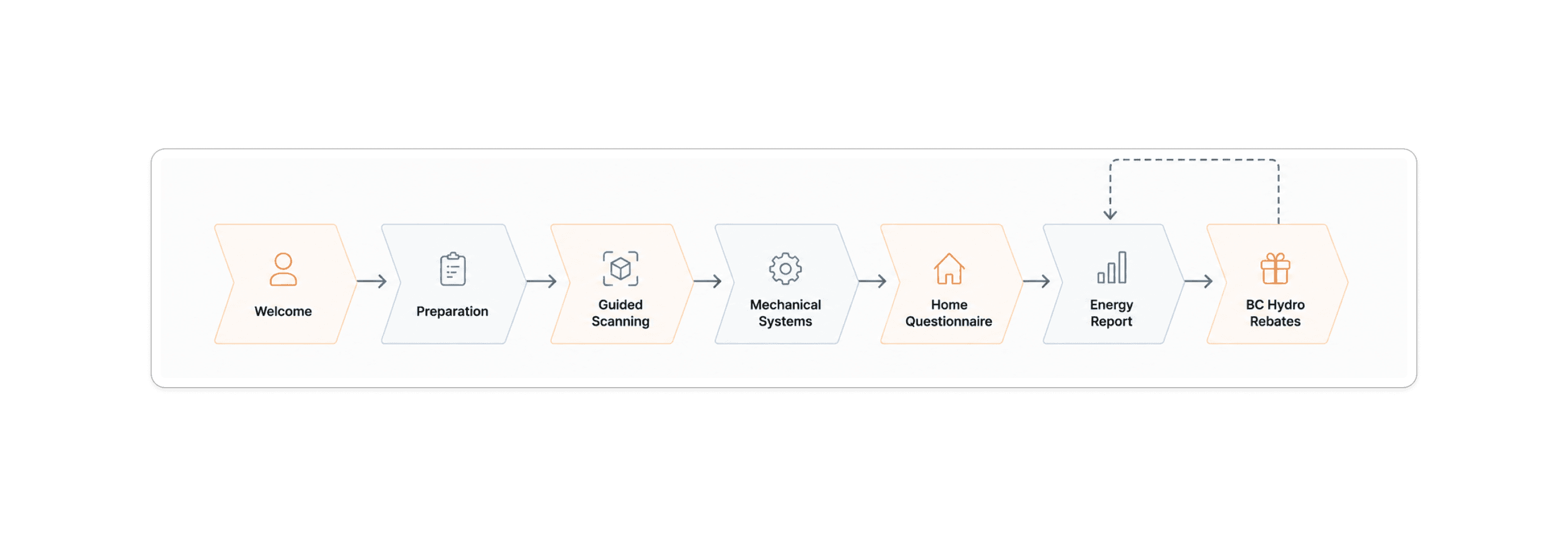
Experience Journey
The experience was designed to progressively guide homeowners through each stage of the assessment, reducing uncertainty while maintaining data accuracy.
Designing the Experience
Guided by these principles, I focused on four critical moments that determined whether homeowners would successfully complete the assessment.
01 Designing a Confident Start
Challenge
Design Goal
Initial Direction
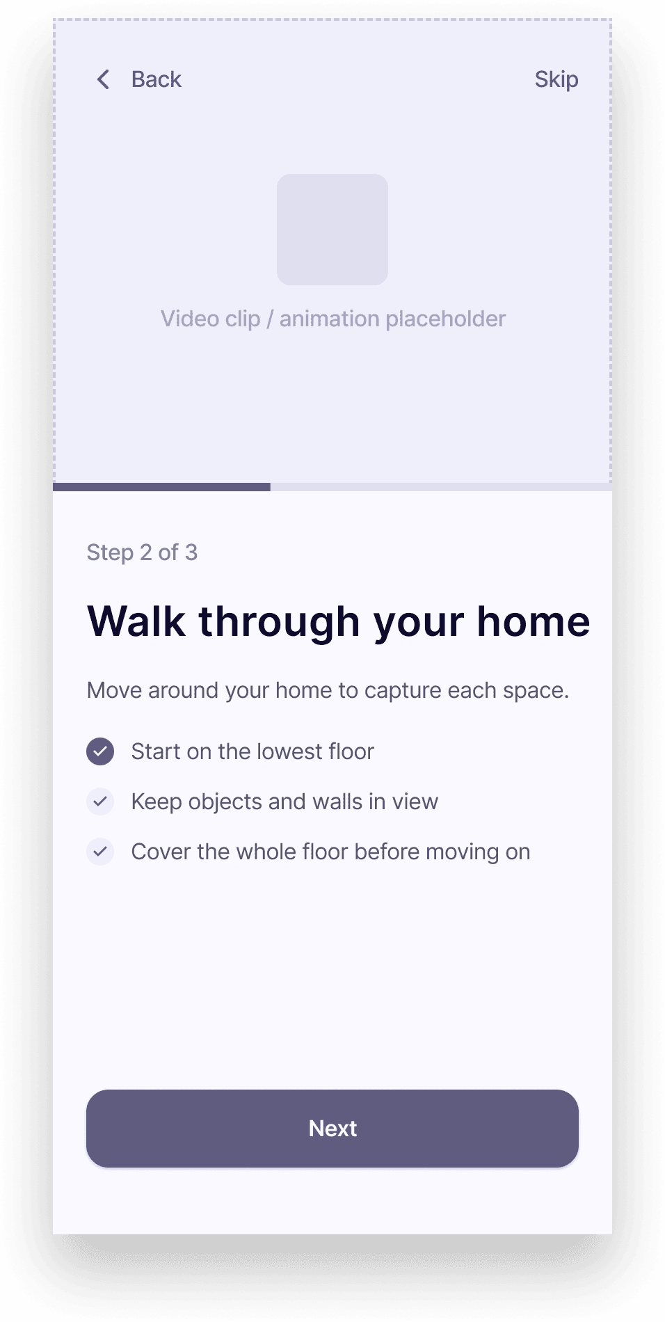
Three-step onboarding flow
Sequential preparation guidance
Clear scanning expectations
Text-supported instructions


Validation
🔍 Observed
Reviewers consistently skimmed the onboarding instead of reading it.
Video and animation required sustained attention before users could begin.
Important actions were buried in dense content.
💡 Insight
Reviewers consistently skimmed the onboarding instead of reading it.
Time-based media creates friction before the first meaningful action.
Users need to identify the next action within seconds.
✅ Decision
Reviewers consistently skimmed the onboarding instead of reading it.
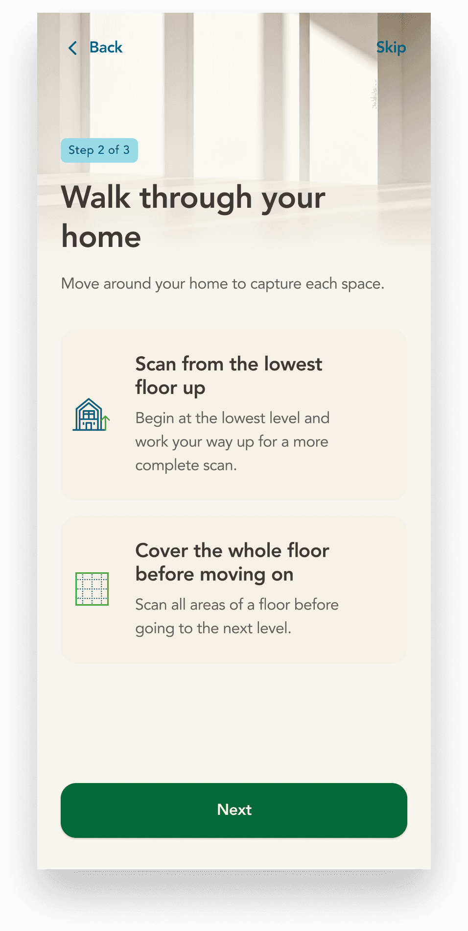
Replaced videos with lightweight visuals and illustrations.
Reduced content and strengthened visual hierarchy around key actions.
Final Experience


Impact (10 Participants)
8/10 participants reported lower cognitive load during onboarding.
9/10 participants found the onboarding easy to understand.
9/10 participants felt confident starting the scanning process without additional guidance.
8/10 participants understood what to prepare before their first scan.
02 Designing a Guided Scanning Experience
Challenge
Design Goal
Initial Direction
Linear room-by-room workflow
Sequential preparation guidance
Clear scanning expectations
Text-supported instructions

V1.0
Validation
🔍 Finding
AI recognition took over one minute to complete.
💡 Insight
Waiting without making progress increased frustration and disrupted momentum.
✅ Decision
Deferred manual equipment entry to the later part of the questionnaire, allowing users to continue scanning or answer other questions while AI processing completed in the background.

V2.0
The Flow Worked... But One Assumption Didn't…
The waiting problem was solved.
But real homes turned out to be more complex than we expected.
Some homeowners had multiple heating or hot water systems, requiring the flow to support repeated equipment capture without disrupting the scanning experience.

V3.0
From Flow to Interface
Once the overall scanning workflow was validated, I shifted my focus to refining the interaction details that users experienced throughout the journey.

Unexpected User Feedback
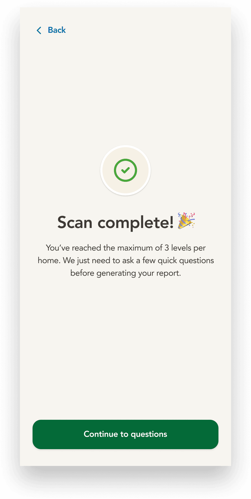
During testing, participants assumed they could continue scanning additional floors. When the experience automatically ended after the third floor, several users felt surprised because the limit had never been communicated.
The issue wasn't the limit itself—it was when users learned about it.
✅ Design Response
Tailored the completion experience based on scan progress. Users who reached the three-floor limit received clear confirmation that they had reached the maximum supported number of floors, while others could continue scanning.


We Thought We Had It Covered
Thanks to our previous experience designing Stride for professional contractors, we were confident that we had addressed one of the most confusing parts of the scanning experience: stairs.
We had already introduced clear onboarding guidance explaining that stairs should not be scanned, and expected the rule to carry users through the assessment.
"What should I do with the stairs?"
Should I capture a few steps while scanning this floor?
Should I wait until I reach the next floor?
Will skipping the stairs affect my assessment?
✅ Refining the Guidance
Rather than adding more copy, we explored whether a short animation could communicate the scanning behavior in just a few seconds.

03 Evolving the Mechanical Check
The Flow Needed to Adapt
After moving the Mechanical Check into the questionnaire, we uncovered another usability issue during testing.


Real homes don't always have just one heating system.
Some users needed to capture multiple pieces of equipment before continuing, which the existing flow didn't support.
✅ Design Response
We redesigned the flow to treat equipment as a collection rather than a single step. Users could add multiple systems before continuing, making the experience flexible without increasing complexity for most homes.
What we observed
During testing, users instinctively tried to edit the detected values directly instead of looking for a separate Edit manually action.
✅ Design Response
Replaced the separate Edit manually action with inline editable fields, allowing users to modify detected information immediately.


Users spent less time reviewing and correcting detected equipment.
More users completed the Mechanical Check without needing to go back and edit.
The final confirmation flow better reflects real homes while reducing unnecessary interaction.
Looking Ahead
This project is still evolving. While the current flow addresses the major usability issues we observed, future iterations will focus on making the scanning experience even more adaptive as we learn from real homeowner behavior.
Improve guidance for uncommon home layouts.
Reduce manual input through more reliable AI recognition.
Continue validating the experience with homeowners and BC Hydro stakeholders.